
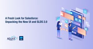
Introduction
Salesforce’s Summer ’24 release is here, and it’s doing more than just giving the Lightning Experience a facelift. This update puts usability, accessibility, and consistency front and center across the platform. Driving these improvements is SLDS 2.0, paired with the eye-catching new Cosmos theme, both working together to create a modern, responsive, and more engaging user interface.
Every interaction feels more intuitive, and custom components now blend seamlessly with Salesforce’s native design. Users benefit from a cleaner, more engaging experience that makes navigation simpler and more enjoyable. Thanks to refined design tokens and flexible styling hooks, developers can build apps that automatically adapt to future updates, ensuring a consistent, scalable interface with minimal effort.
This transformation is a game-changer for users: not only do they enjoy a refreshed, modern interface, but the improved accessibility and intuitive design dramatically enhance day-to-day usability. In this blog, we’ll explore:
- The Visual Transformation: Discover how subtle changes like rounded corners, improved spacing, and enhanced contrast are redefining user interactions.
- Real-World Impact: Learn how these changes benefit both developers and end-users by creating a consistent, modern experience across all Salesforce interfaces.
- The Power of SLDS 2.0: Understand the shift from fixed design tokens to flexible, future-proof styling hooks that allow for effortless customization. Tools that help developers build consistent, scalable and modern components.
Join us on this journey as we dive into the details of Salesforce’s new UI changes, unravel the magic behind SLDS 2.0, and reveal why the Cosmos theme is setting a new standard in enterprise design.
Overview of the New Salesforce UI Changes
This release introduces a new Lightning Experience that improves usability and looks without changing fundamental functionality. The release is centered on making the user interface more intuitive, visually cohesive, and accessible. Major improvements are:
A New, Modern Look
Cosmos Theme:
The new Cosmos theme presents a modern design style with clean color schemes, new typography, and enhanced visual elements. This creates a cleaner look that appears modern and professional.
Rounded Corners & Optimized Spacing:
Among the most visible changes is a greater use of rounded corners across different UI elements, along with new spacing and padding. The small tweaks in these elements help the interface look less strict and more welcoming, leading to an improved friendlier and more inviting user experience.
Better Usability and Accessibility
Increased contrast between background and text colors, as well as more considerate spacing, enhances readability and accessibility. It is especially useful for visually impaired users, since it enables clearer and simpler navigation.
Consistent Layouts:
The new design puts focus on consistency on various pages—be it on regular Salesforce pages or personalized Lightning pages—in helping users get accustomed to the new interface easily and making day to day tasks a breeze.
Seamless, Future-Proof Customizations with SLDS 2.0:
With SLDS 2.0, Salesforce now offers flexible, publicly maintained styling hooks instead of just fixed design tokens. This approach ensures your custom components automatically update with new theme values, future-proofing your customizations and maintaining a consistent look without constant manual CSS tweaks.
Visual Enhancements: Rounded Corners, Improved Accessibility, and Better Design
Salesforce’s Summer ’24 release brings a host of visual improvements that not only modernize the look of the platform but also enhance usability and accessibility. In this section, we explore these enhancements in detail, supported by illustrative screenshots.
Cosmos Theme Overview
The new Cosmos theme is at the heart of the visual refresh. It introduces a refined design aesthetic featuring updated color palettes, improved typography, and a cleaner layout. The overall effect is a more contemporary and professional interface that sets the stage for a better user experience.
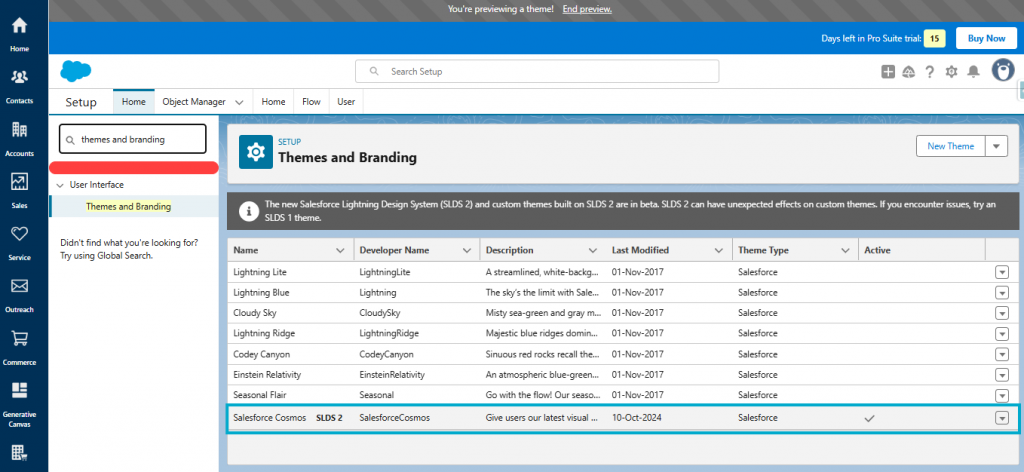
Enabling the Cosmos Theme –
Administrators need to enable the new Cosmos theme via Salesforce setup to take advantage of it. Here’s how:
- Navigate to Setup:
Log in to your Salesforce org and click the gear icon in the top right corner, then select Setup.
- Access Themes and Branding:
In the Quick Find box, type “Themes and Branding” and select it from the results.
- Activate the Cosmos Theme:
In the Themes and Branding section, locate the Cosmos theme. Click Activate to enable the new theme for your organization. You may also preview it before activation to see how it will appear across your pages.
- Assign the Theme:
After activation, the new Cosmos theme will be applied to all standard pages. For custom Lightning pages, ensure that your custom components are built using SLDS 2.0 styling hooks so they inherit the new design seamlessly.
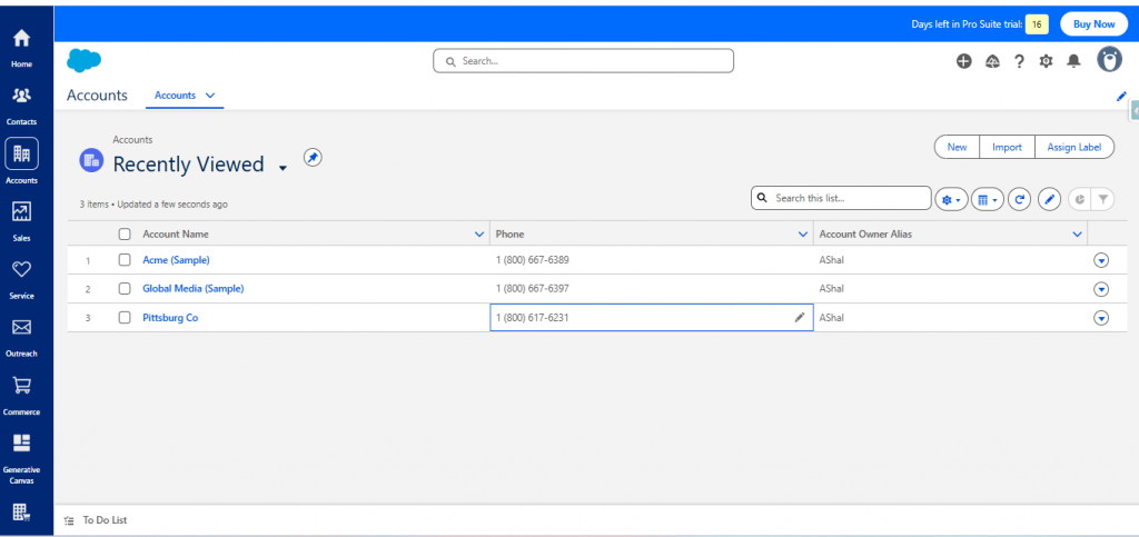
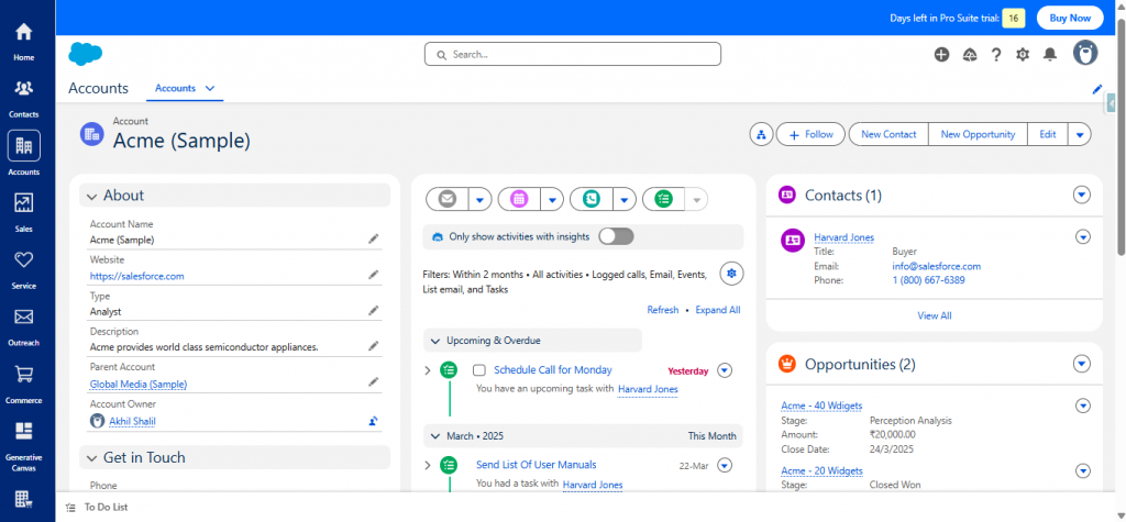
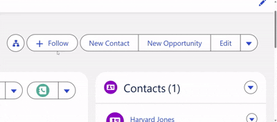
Before-and-After Comparison
One of the most compelling ways to appreciate the change is by comparing the old and new interfaces side by side. This comparison clearly shows how subtle yet impactful changes have been implemented:
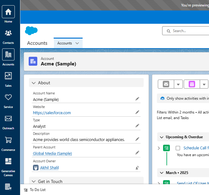
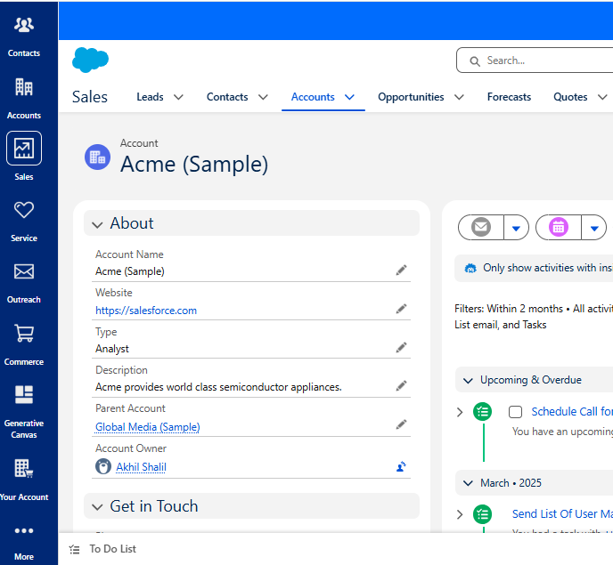
Comparing them side by side, we can observe how rounded corners, improved spacing, and increased contrast collectively enhance the usability and aesthetic of the Salesforce interface. If you are considering implementing the Cosmos theme, these examples should illustrate how the new look can enhance your organization’s user experience.
Key Differences –
- Rounded Corners –
Observe in the “After“ screenshot how the buttons and cards have softer, more rounded corners. Not only is this more contemporary, but it also makes the interface appear friendlier.
- Proper Spacing –
Notice the area around the “About“ section and its corresponding lists. The new design provides more symmetrical padding and margins, presenting it in a cleaner and less cluttered appearance for better readability.
- Increased Contrast –
Notice how the text is more readable over the background in the new version. Improved contrast between headings, body text, and background makes it easier to read.
- Streamlined Icons & Typography –
Small adjustments to the icon layout and font selection give the page a sense of cohesion. The adjustments assist in providing a cohesive and professional brand experience.
- Uniform Layout throughout Sections –
The new layout design ensures that all elements of the page—such as the detail tabs and related lists—are consistent in their design principles. This simplifies navigation for users across Salesforce pages.
Deep Dive into SLDS 2.0 :
What is SLDS 2.0?
SLDS 2.0 is the next generation of Salesforce’s design framework that further enhances the Lightning Experience. It builds on the principles established in SLDS 1.0 but goes further by addressing some key challenges that developers previously faced. Rather than relying exclusively on fixed design tokens and internal CSS variables, SLDS 2.0 introduces publicly supported styling hooks—making customization simpler and more robust.
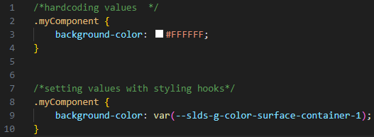
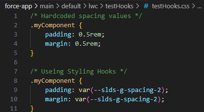
Dynamic Styling with Public Styling Hooks
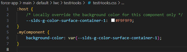
One of the most significant changes is the introduction of styling hooks. In SLDS 1.0, many components used fixed, internal variables (often with the –lwc- prefix), which weren’t intended for direct modification. SLDS 2.0 shifts this approach by exposing design values as flexible, publicly maintained CSS variables (prefixed with –slds-).
Let us look at some examples to see how Styling hooks can be used –
Example 1: Using a Styling Hook for Background Color
Example 2: Customizing Spacing with Styling Hooks
Example 3: Overriding Styling Hooks Locally
Some of the advantages of using Styling hooks –
- Dynamic Updates:
Your elements automatically inherit fresh design values when Salesforce updates its themes or tokens—no action is required on your part.
- Flexibility in Customization:
Styling hooks enable you to change or customize certain things at your will. This enables you to change the look of individual elements without changing the overall design.
- Improved maintenance:
Declaring CSS variables as public rather than as hard-coded values makes our code cleaner, more maintainable, and more flexible to change with future updates.
- Seamless Integration:
Styling hooks reveal the design tokens employed. This enables our own components to seamlessly integrate into Salesforce’s native UI, maintaining the look and a consistent feel across the entire platform. These advantages render styling hooks an incredible asset in SLDS 2.0 for creating enduring, consistent, and flexible user interfaces.
Ensuring SLDS 2.0 Compliance: How the SLDS Validator Helps
The SLDS Validator is an essential tool for any developer working with the Salesforce Lightning Design System (SLDS), especially with the improvements in SLDS 2.0. It serves as a quality check to ensure that our custom components adhere to Salesforce’s design guidelines and best practices.
Why should we use Validator –
- Consistency:
The validator helps maintain a uniform look and feel across your custom components by ensuring they follow the same design patterns as Salesforce’s native components.
- Early Issue Detection:
Catch errors and deviations from best practices early in the development process. This prevents unexpected behavior and layout issues when your components are deployed.
- Improved Accessibility:
By flagging accessibility issues, the tool guides you to make your components more inclusive and user-friendly.
- Future-Proofing:
Using the SLDS Validator ensures that your components are built with officially supported styling hooks and tokens. This means that as Salesforce updates its design system (for instance, with the Cosmos theme), your components are more likely to adapt without breaking.
The instructions to setup SLDS Validator for VS Code is given here – https://www.lightningdesignsystem.com/2e1ef8501/p/8184ad-transition-to-slds-2
Let us look at some examples that illustrate the usage of SLDS Validator that helps developers stay on track while developing components that adhere to the latest design guidelines and best practices for consistency, accessibility, and future-proof customizations.
Example:-
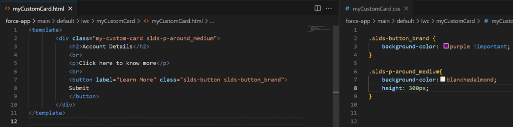
To generate a report for your Lightning Web Components, use the SLDS: Generate SARIF Report command. Once the report is created, open the SARIF file in VS Code’s SARIF Viewer to review any flagged violations or best practice warnings.
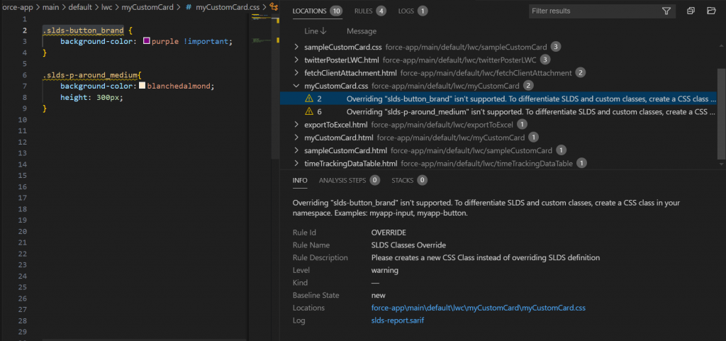
As shown in the screenshot, the report highlights issues such as overriding core SLDS classes (for example, slds-button_brand), which isn’t supported. Each entry provides a description of the problem, the file and line number where it occurs, and a recommended fix—helping you quickly identify and resolve non-compliant code.
Fixing the issue –
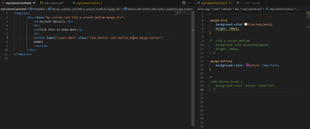
Instead of directly overriding a core SLDS class (such as slds-button_brand), we define our own classes for unique styling. For instance, we use myapp-div for the container and myapp-button for the button. By applying custom CSS to these classes rather than modifying SLDS classes directly, we avoid potential design conflicts and maintain compatibility with Salesforce’s evolving design system.
Conclusion
Salesforce’s new user interface refreshes and SLDS 2.0 isn’t about making the Lightning Experience more attractive; it’s about creating a platform that is easier to use, accessible, and future-proof. Using styling hooks means your custom components stay in sync with Salesforce’s changing design expectations. With tools like the SLDS Validator and SARIF reports, you avoid making common mistakes, such as overriding fundamental SLDS classes, and using design tokens instead of styling hooks so your components are beautiful and maintenance-friendly.
If you’re enabling the Cosmos theme, fine-tuning space, and contrast, or testing your code for accessibility, these changes and best practices ensure that a fresh, adaptive user interface is developed to evolve with Salesforce’s continued updates. Through these concepts, developers and admins can ensure that everyone enjoys a similar, well-constructed experience throughout the Salesforce world.
Author: Akhil Shalil