Introduction
Salesforce has recently announced an exciting Lightning User Interface (UI) update designed to enhance your productivity and streamline your workflow. While its effectiveness ultimately depends on its integration into your specific workflow, this latest Salesforce UI update promises to simplify your daily tasks significantly.
What’s new in the latest update!
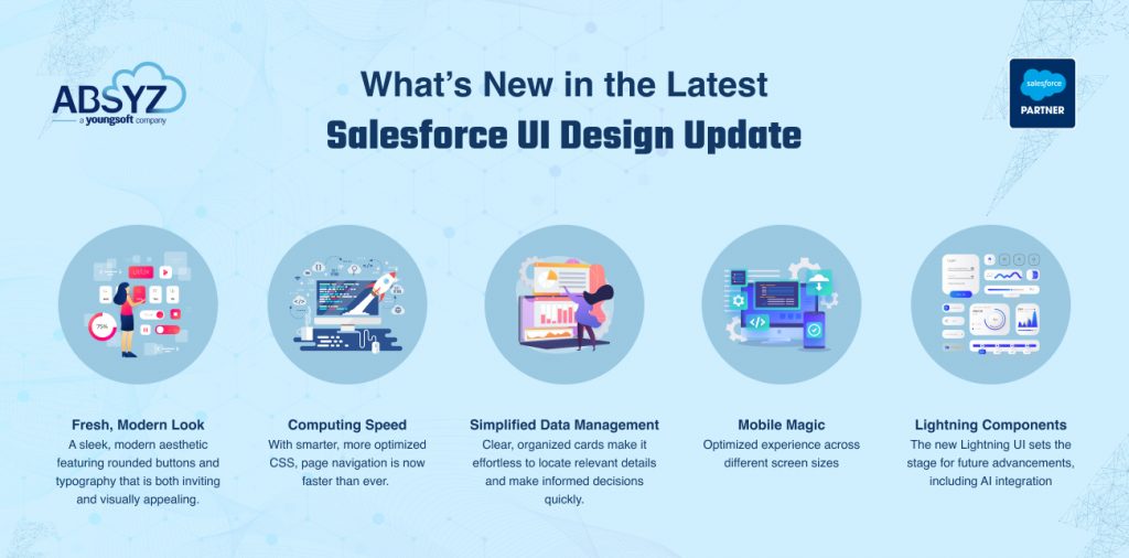
The updated architecture provides the computing speed you’ve always dreamed of. With smarter, more optimized CSS, page navigation is now faster than ever. Experience a seamless browsing experience with Lightning UI, eliminating the frustrating loading times.
For those of us who are constantly pressed for time, navigating between various online tasks or waiting for multiple tabs to load can be a hassle. Now, with fewer clicks and less complexity, you can accomplish tasks more efficiently. Spend less time searching and more time doing what matters.
Benefits of the new UI design
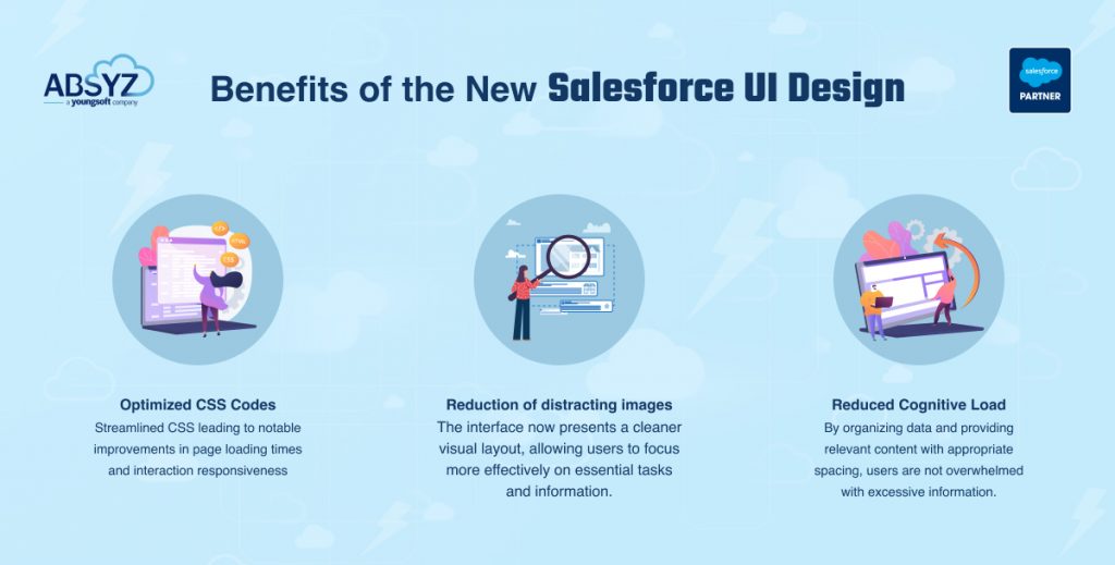
3) Decluttered Data Presentation: By organizing data and providing relevant content with appropriate spacing, users are not overwhelmed by excessive information. This allows them to focus on their tasks without feeling overloaded.
4) Rounded Icons: By rounding icons, Salesforce aligns with the natural human preference for soft, safe shapes over sharp ones. This makes icons more visually pleasing and easier to process, helping users maintain concentration and work longer with fewer distractions.
Contrast and accessibility of the new design
Web accessibility is critical to user-centric design in the digital age, and it goes beyond simple technological requirements. The major change in the salesforce design is the change in contrast. Salesforce aims to improve accessibility for users with low vision and color blindness by modifying color contrasts. It becomes easy for the user to read content, check the platform, and different features when contrast ratios are improved because text, photos, and interface components are clearly visible against their backgrounds. With this update, Salesforce is also inclined to provide an equal user experience while also complying with accessibility guidelines like the Web Content Accessibility Guidelines.
These modifications are based on five fundamental ideas that directed the redesign. With no jarring transitions, the site will now provide a more cohesive and linked layout, guaranteeing users have a seamless navigation experience. The design is now more flexible, taking into account a wider range of user inputs as well as different contexts, languages, and cultures. Furthermore, the interface has been made more intuitive so that it requires less explicit instructions to learn, comprehend, and navigate. Users feel supported and guided by trusted aspects, which guarantee the site’s continued stability and dependability. Lastly, the improvements are enjoyable, with the goal of making the experience more fulfilling and alluring so that people can feel happy. These well-considered enhancements will make the Salesforce UI more interesting and helpful by increasing accessibility and enhancing user interaction overall.
By making the website easier to read and use overall, higher contrast ratios are advantageous to all users. Content with increased contrast, for example, will be easier for consumers to detect when using in direct sunlight or on glare-prone screens. Plus, a big chunk of people browse the platform on small displays as the digital world grows more mobile. When it comes to mobile devices, where screen real estate and smaller text might compromise visual clarity, improved contrast can make a big difference in user experience. Salesforce is making certain that its content is accessible and easy to use on all platforms and in all viewing conditions by giving contrast enhancements top priority.
In conclusion, the enhanced Salesforce UI will bring a level of simplicity and efficiency that revolutionizes CRM systems. From its visually appealing design and rapid performance to its intuitive navigation and future AI-driven capabilities, it will redefine how you work.
Prepare yourself for the most advanced Salesforce experience yet.
Challenges that users can face and how to mitigate them
1) Compatibility issues with custom components
When Salesforce releases the enhanced UI changes for all, organizations will need to ensure that custom components that currently utilize the existing base classes are not affected by the changes. These custom components might face issues where they do not render correctly or do not function properly as expected. This could happen because of certain discrepancies between the old and the newly introduced base classes. This means that organizations will have to do a comprehensive review and testing of all the custom components and configurations present in their Salesforce systems.
It is important to understand that these changes will not affect any functionality or business processes. However, to make sure that these changes run smoothly, even for the custom components, organizations need to have a comprehensive regression testing plan in place. This plan would involve identifying the test cases covering all the critical functionalities of custom components and executing the scripts through any automation tools. Finally, they need to make sure that they continuously audit and update the plan to cover all the possible scenarios.
2) User Adoption
User Adoption is another critical issue that organizations could face. Employees accustomed to using the existing user interface may face difficulties in getting used to the new UI. This could lead to a reduction in their productivity for a certain period when they are navigating the learning curve. In order to mitigate the risk of facing such issues, organizations need to have a proper user adoption plan in place. This would involve conducting workshops and hands-on sessions for the employees. It would also be helpful if organizations distribute support resources such as FAQs and user guides to their employees.
3) Updation of documentation
The release of the new UI design would necessitate that all the project documentation be updated according to the new UI design. Changes will have to be made to the user manuals, training materials, and internal guides. Organizations will have to invest a lot of time and effort into this. To navigate this issue, an elaborate plan has to be in place which would include auditing the existing documentation, creating a documentation plan and finally maintaining the documents.
Understanding the effect of the latest changes for Developers!
How will these changes affect your Salesforce pages and sites?
- If the visual design of your pages or experience site have been customized by using supported techniques, these new changes will have almost no impact on your customizations. These supported techniques for customizing the styling of Lightning components differ depending on the model you use: Lightning Web Components (“LWC”) or Aura Components.
- If you have customized the site or lightning pages using unsupported CSS overrides, then your customizations can lead to undesirable visual changes or regressions when Salesforce updates its architecture.
Visual regressions, in simple terms, mean that the look and feel of your page are different from what was expected. The particular regressions that happen to your site or page will depend on the specific customizations that you have done. Some of the areas where you can expect to see regressions include the color, spacing, fonts, borders or the layout of the page.
What are the unsupported techniques that might cause visual regressions?
Developers should avoid using the following customizations:
● Overriding BEM style classes with deprecated syntax.
Salesforce had deprecated the BEM double-dash style classes in the Summer ’21 release. Now, they plan to remove those classes in a future release. Thus, Salesforce strongly recommends that developers use the current BEM syntax, which includes an underscore instead of a double-dash. For more information about the BEM syntax in SLDS, we recommend you visit the Markup and Style page.
● Targeting child DOM elements.
Starting with the Summer ’24 release, Salesforce is changing the internals of some UI components, which can change the rendered DOM. Therefore, it is strongly advised that developers shouldn’t modify the DOM elements of Salesforce components via CSS or JavaScript or target SLDS classes in unit tests. For more information on this, you can visit the Salesforce Component Internals Are Protected page and the Anti-Patterns for Component Styling in the Lightning Web Components Developer Guide.
● Overriding CSS of Salesforce components.
The LWC Developer Guide cautions against overriding Salesforce components and their internals with your custom CSS. For more details on this, you can refer to Anti-Patterns for Component Styling.
● Use of unsupported –sd&s- styling hooks.
Styling hooks were introduced as a beta feature in the Winter ’21 release. Earlier, they were to be incorporated by using the –sds- namespace. In Spring ’22, these styling hooks became generally available, however, the namespace used was changed to –slds-. Thus, it is advisable to use the –slds- namespace. For more information on this, you can visit the Customize Components with Lightning Design System Styling Hooks (Generally Available) release note.
● Use of –lwc custom properties
- For the lightning pages, Salesforce strongly recommends you to replace –lwc custom properties with –slds styling hooks so as to avoid regressions if the –lwc custom properties are removed in future releases.
- For the Experience Cloud LWR sites, Salesforce encourages you to replace the –lwc custom properties with –dxp, –slds-c, or –slds-g-color styling hooks. For more information on this, you can visit the –dxp Styling Hooks page.
How can you prepare your Experience Cloud sites for the new updates to SLDS architecture?
- CSS overrides done in the Experience Cloud sites shall continue to work as Salesforce moves to styling hooks. There is no need to update them.
- However, the sites that use CSS overrides will not be able to adopt future product innovations of the user interface without facing visual regressions.
- When you’re referencing –lwc custom properties, Salesforce strongly recommends you to replace them with –dxp, –slds-c, or –slds-g-color styling hooks.
For more detailed information, we recommend you have a look at this Salesforce Help page.
Conclusion
In conclusion, the enhanced Salesforce UI will bring a level of simplicity and efficiency that revolutionizes CRM systems. From its visually appealing design and rapid performance to its intuitive navigation and future AI-driven capabilities, it will redefine how you work.
Prepare yourself for the most advanced Salesforce experience yet.
Authors: